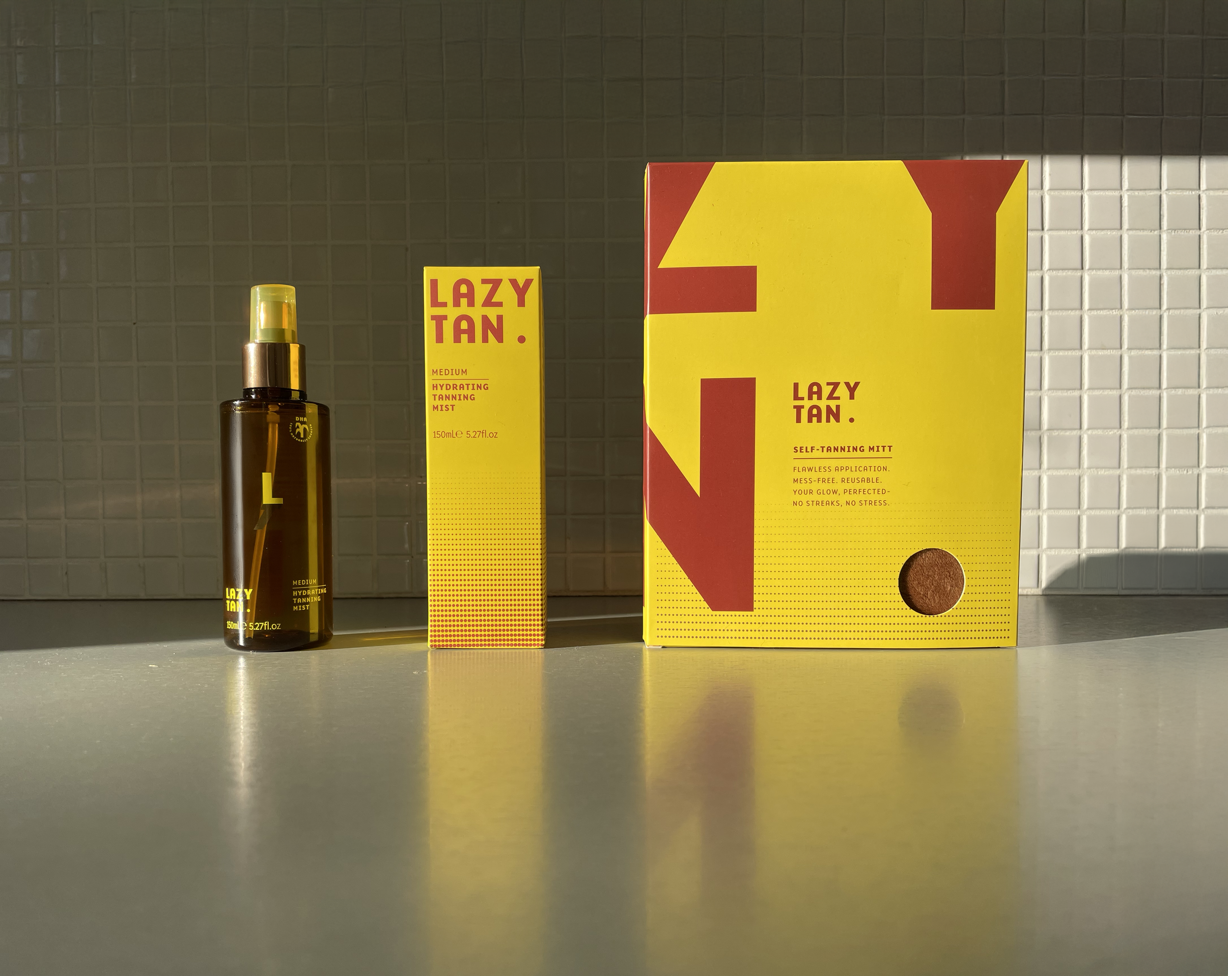
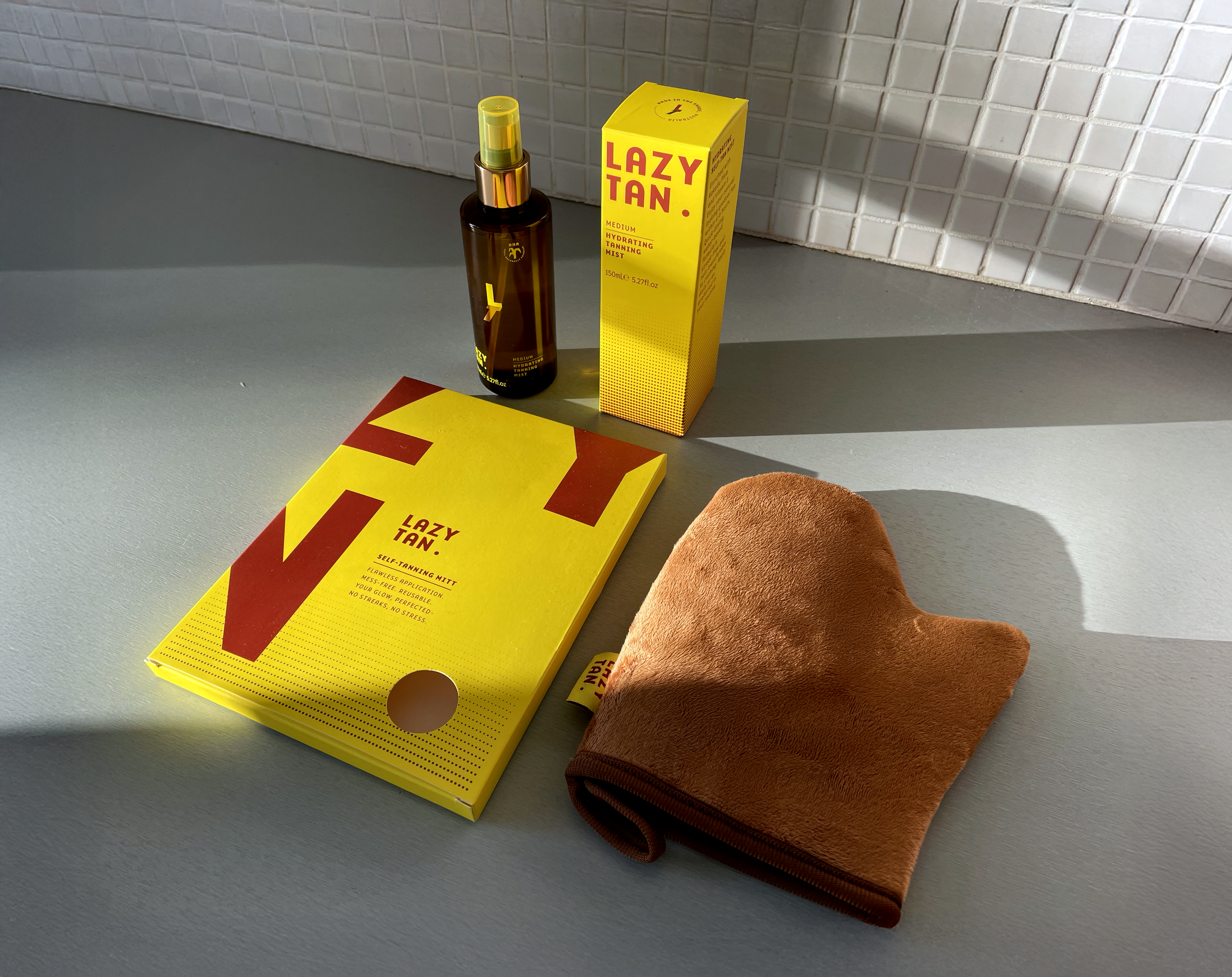

LAZY TAN
Packaging design
The Problem:
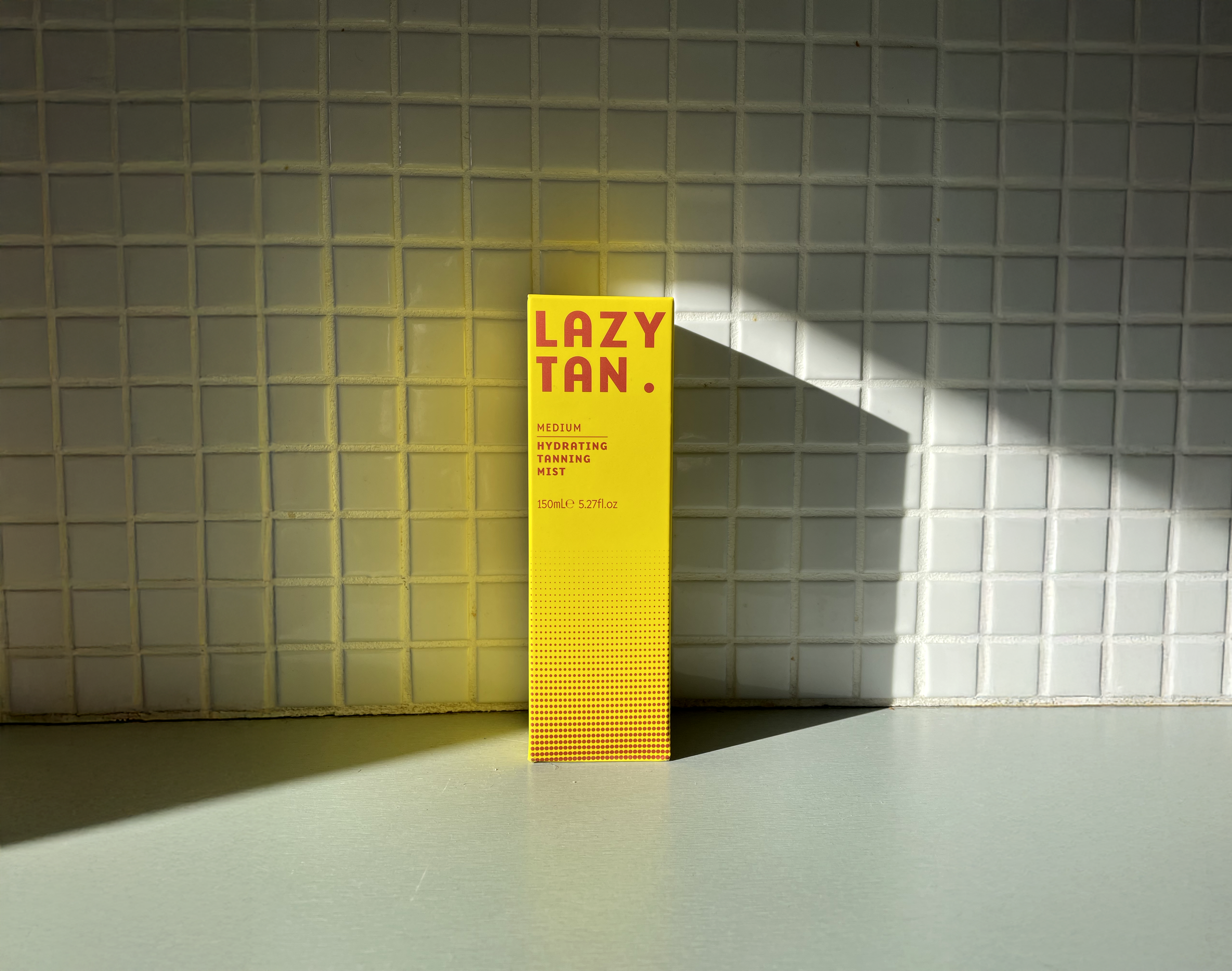
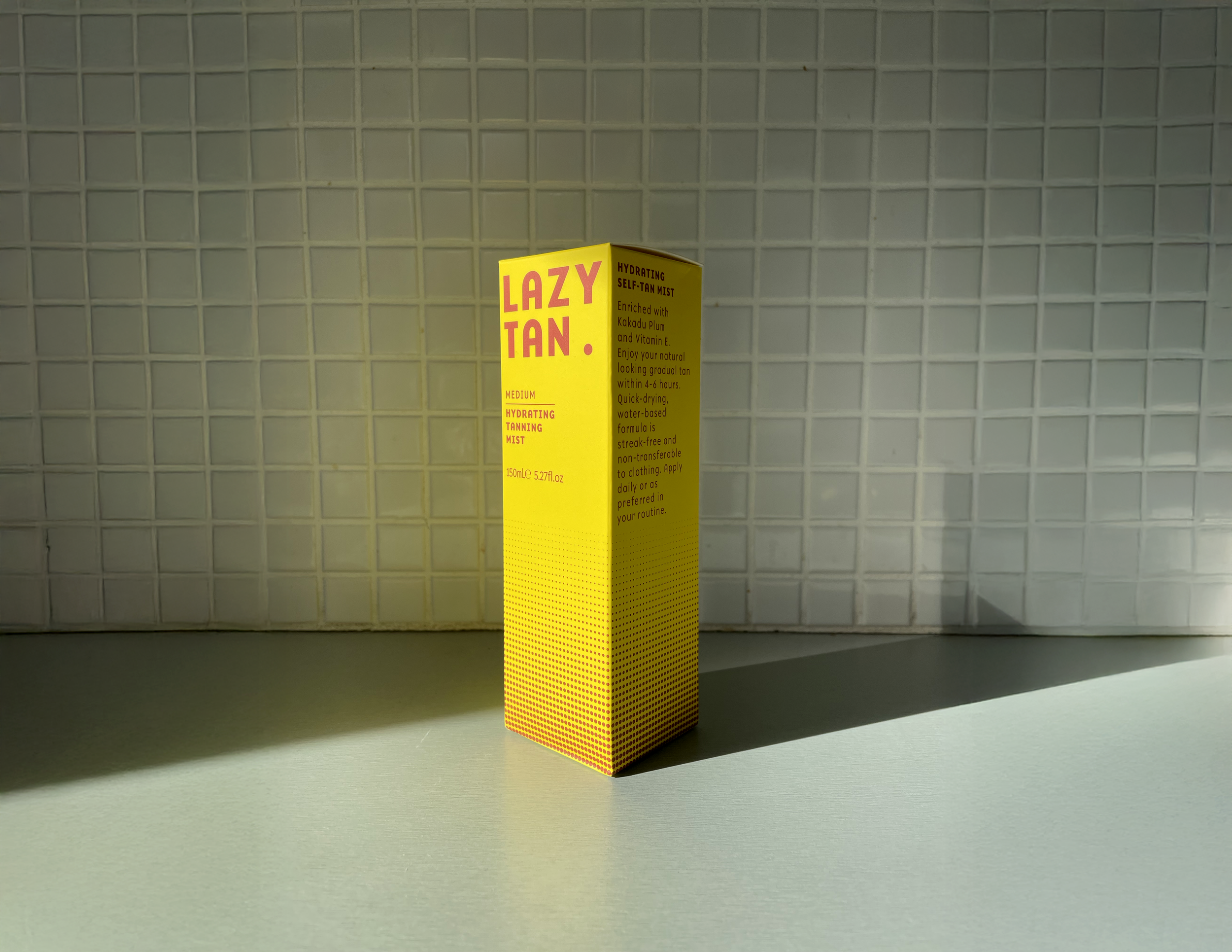
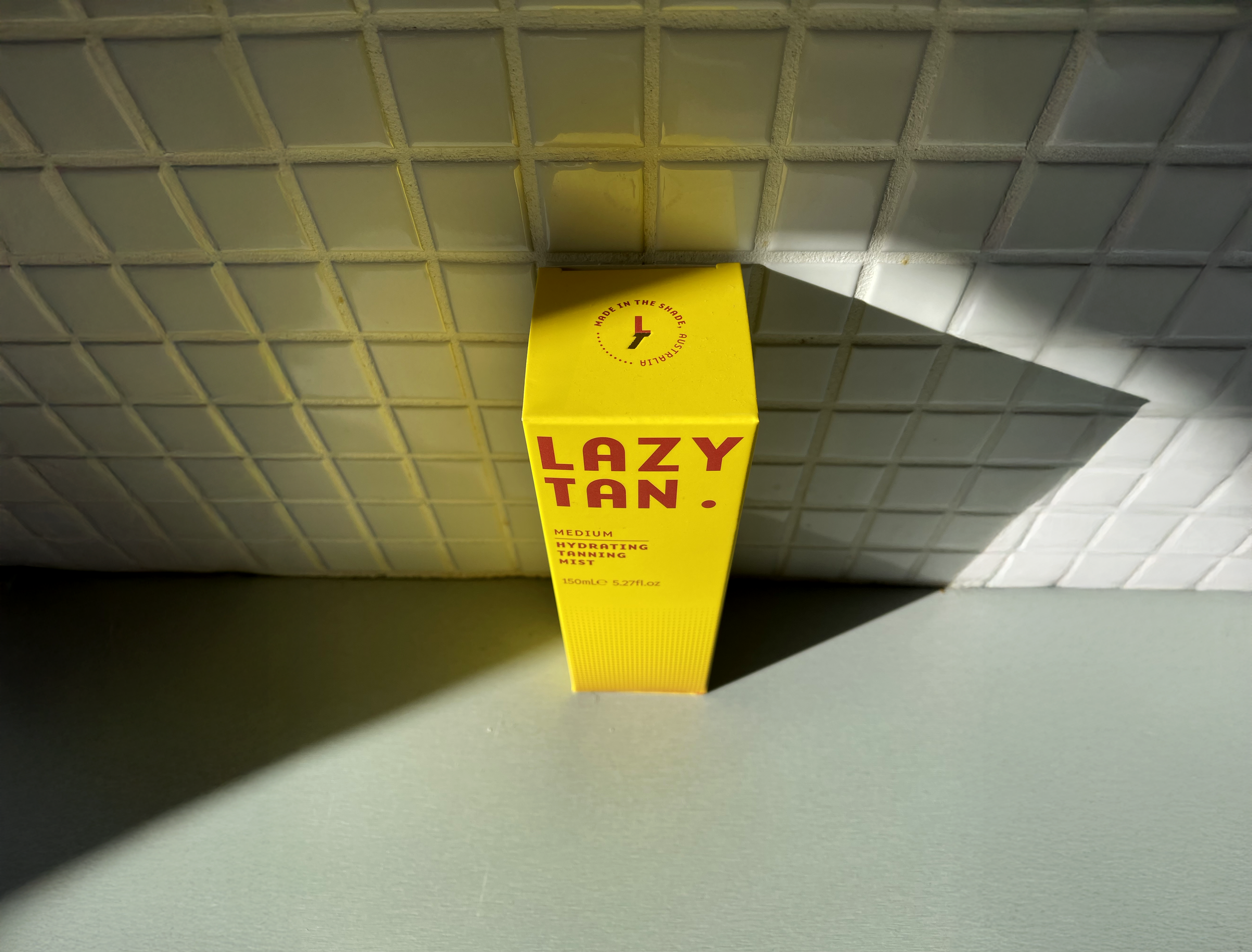
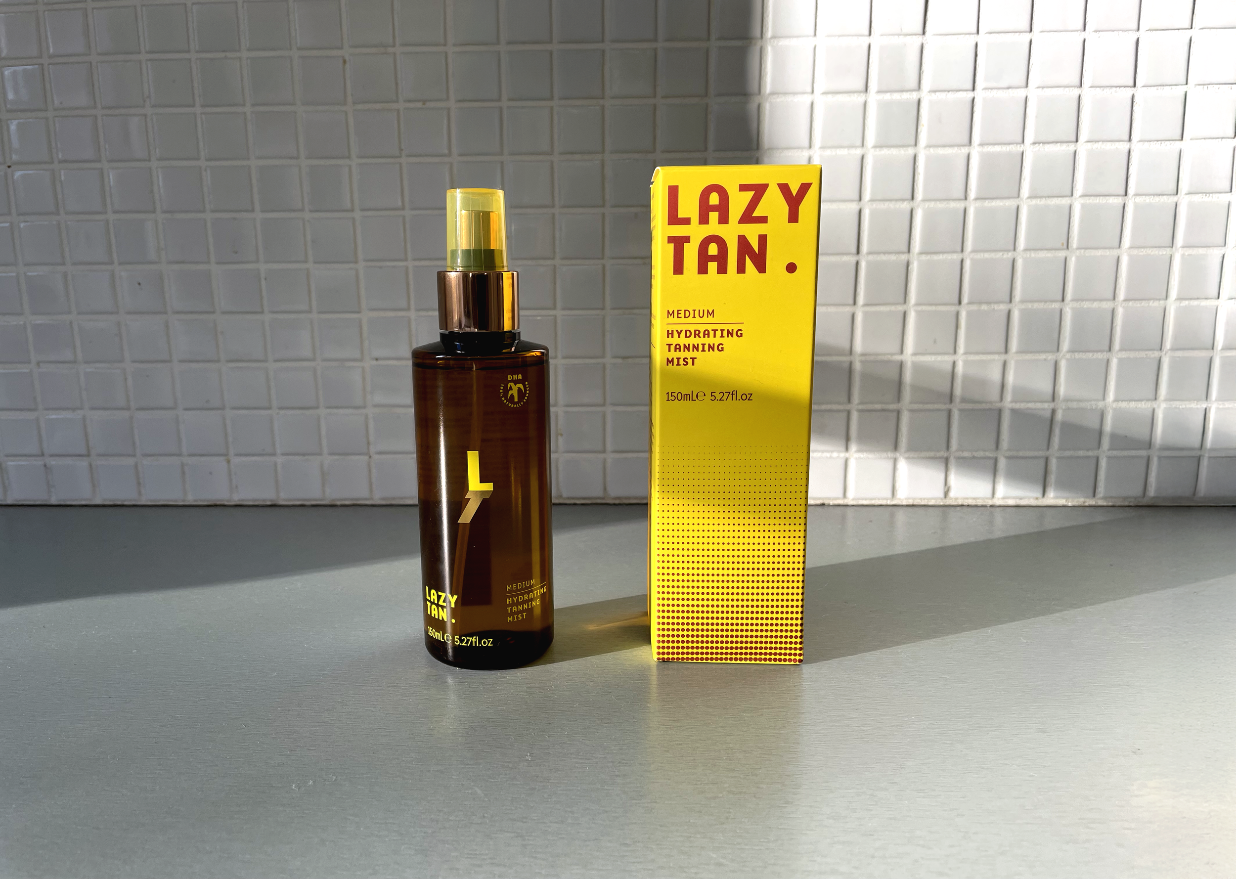
Lazy Tan champions sun-safe beauty while delivering a flawless tan. The brief was to design a self-tan mist carton that felt confident, distinctive, and stood out on shelf.
My Thoughts:
Working within Lazy Tan’s existing brand guidelines, I focused on elevating the visual language to feel bolder, fresher, and more contemporary, while maintaining strong brand recognition.
Solution:
The final packaging design places the logo at the centre, creating a confident and modern shelf presence. A bold colour palette inspired by Australia’s vibrant landscape reinforces the brand’s energetic personality and sun-safe positioning.